Crew Monitor Case Study
A tablet-first crew safety dashboard for the marine industry.
Designed for bridges, decks, and engine rooms — where the interface must work in direct sunlight, pitch-black night watches, and through neoprene gloves.
Project Overview & Context
Project Title
Crew Monitor. Tablet web dashboard for vessel crew safety monitoring.
My Role
UX Designer and Researcher - research, design system, component architecture, interactive prototype.
Officers of the watch (OOW) on vessels need to track their entire crew in real time — who is active or on break, who has triggered a man-overboard alert, or where everyone is on board.
Existing solutions are often fragmented and difficult to read in harsh marine conditions, rarely accounting for gloved operation on a moving platform.
The goal was to design a single-surface dashboard that makes crew status readable at a glance, reduces alert response time, and meets maritime fatigue-tracking and audit requirements — all within the physical constraints of the marine industry environment.
Problem statement & Project Goal
Target Audience
Officers of the watch (OOW) aboard vessels. Safety officers reviewing audit logs. Fleet managers overseeing multiple vessels remotely.
Timeline & Constraints
A weekend Case Study developed, prototyped, and iterated using Claude AI and Claude Design. The project addresses the unique physical constraints of vessel environments — such as gloved operation, moving platforms or maritime compliance — setting it apart from standard application design.
Design Process
Environment & Constraint Research
Marine dashboards operate in conditions most digital products never face: 40,000+ lux direct sunlight, dark-adapted night vision, gloved operation, and a moving platform. In this project I didn’t treat them as edge cases — for me as a researcher, they were the primary use context.
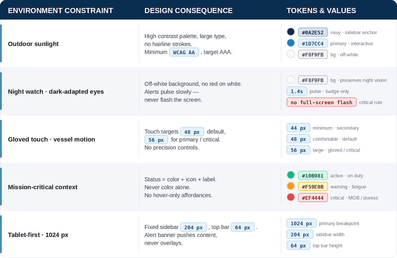
My research focused on marine safety conventions and fatigue-environment requirements. As a result, every constraint was mapped to an explicit design decision before a single component was designed.
Design System - Tokens as Source of Truth
Rather than treating constraints as limitations, I worked on defining and encoding them directly into the design system as tokens. As a Minimum touch targets became a spacing token. Night-vision safety became a rule that bans pure white surfaces and full-screen flashes. By this, any component that violates a constraint, is caught at the token level and improved.

Component Architecture
Components were designed around the crew card as the atomic unit. A crew card shows name + role, status badge, location on vessel, and last heartbeat timestamp — all readable at arm's length, all touchable through neoprene. From that atom: the crew grid, the alert banner, the sidebar roster, and the shift view were composed.
Claude IA - Direct Collaboration, Not Generation
This project was built using Claude Design and Claude AI as design collaborators: Claude enforced the system, I made the decisions.
Claude was used to:
See the complete Design System
High Fidelity Mockups
The high-fidelity mockups bring my solution to life. They showcase visual design and detailed elements of the application.
SPLASH SCREEN & LOGIN / REGISTER MAIN SCREEN & RECIPY DETAILSPROFILE & PROFILE UPDATESHOPPING CATEGORIES & PRODUCTS LISTSCALLENDAR & MEALS CONFIGURATIONFAVOURITES SECTIONSolution & Resulta
Final Design Showcase (Prototype)
The interactive prototype demonstrates the core officer-of-the-watch workflow: crew status overview — alert response — acknowledgement and logging. It was built in Claude using the token-based design system. Every component references a design token and no values are hardcoded.
Key Design Features
This section offers crucial insight into the What's for Dinner? application's core features and functionality. It has been designed as a Development Handover, giving developers a precise and detailed understanding of the system. However, it also serves as an indispensable resource for anyone looking for a clear and concise overview of how the application works.
In my mind it's always nice to share your work with development team in a clear and concise way. That’s one of my ways to hand over the project, where one can go through all the key features, not necessarily being a developer :)
Honest Gaps & Further Considerations
This is a research-stage system built without access to the production codebase, a Figma file, or real user testing. That context matters, and that is why, I am making sure these gaps are documented explicitly rather than hidden:
No testing on real tablet hardware in sunlight or night-watch conditions —designed for those conditions based on research and conventions, but never tested there. That's a gap. It might look perfect, but it might also reveal something unexpected.
Dark mode / night-watch mode is specified in constraints but not yet designed — that's why alerts never flash the whole screen and the background is off-white rather than pure white. A dedicated dark mode for night watch use has not yet been designed. It's specified as a requirement but not yet solved as a design.
Micro-copy for alerts and error states was inferred from the brief — alert messages, error states, confirmation prompts were defined with context and tone in mind, but they need validation against real operational language.
No user testing has been conducted — touch target sizing is based on marine-industry conventions, not observed behaviour. Maybe 48px is fine, but maybe a specific action needs to be even bigger. Will be known only when put in front of real users.
“Designing this system reinforced a principle I hold as a UX designer: constraints are not limitations — they are the brief. The best design decisions in this project came directly from the physical environment, not from aesthetic preference. Every token, every touch target, every motion duration has a reason that traces back to the bridge.”
-Karolina :)