UX Design Challenges
Daily UI
Welcome to my Daily Design Challenge journey! Here, together with the DailyUI community I am taking on various interesting projects, through which I’m improving my skill set, and growing as a designer :)
It’s a work in progress, so more little projects will pop up soon!
#002 Challenge
The Challenge #002 was to design a Credit Card Checkout screen. I extended this by including some of the shopping processes that typically accompany card payment. My initial thought was to design it for a mobile view, as people often shop on their phones. I also created some Lo-Fi frames to place all core elements and develop my general ideas in further Hi-Fi and Prototyping stages. Enjoy!
Low Fidelity Wireframes
High Fidelity Wireframes
Prototype
#003 Challenge
The Challenge #003 was to design a landing page for a product of my choice. I decided to create a page for a foreign language speaking academy, with the goal of encouraging parents to sign up their kids and give them the confidence to express themselves.
In my design, I tried to express all the associations we have with childhood—a fun, carefree, and educational period of life. I also created an additional screen with more detailed information, which can be accessed by clicking the "See More" button.
I had a lot of fun creating it and delving into my own childhood memories. I hope you can experience that too!
Landing Page
Learn More Screen
#021 Challenge
The challenge for this project was to design a home monitoring app. My goal was to create a dashboard that was not only appealing and fun to use but also highly functional.
I used a color palette that evokes a comfortable, homey feeling, and I hope it resonates with you. The app includes core features like live camera feeds and the ability to control all rooms and their devices, as well as add new ones. My main focus was on simplicity, ensuring the design is intuitive and easy to navigate.
Mobile & Tablet View
#083 Challenge
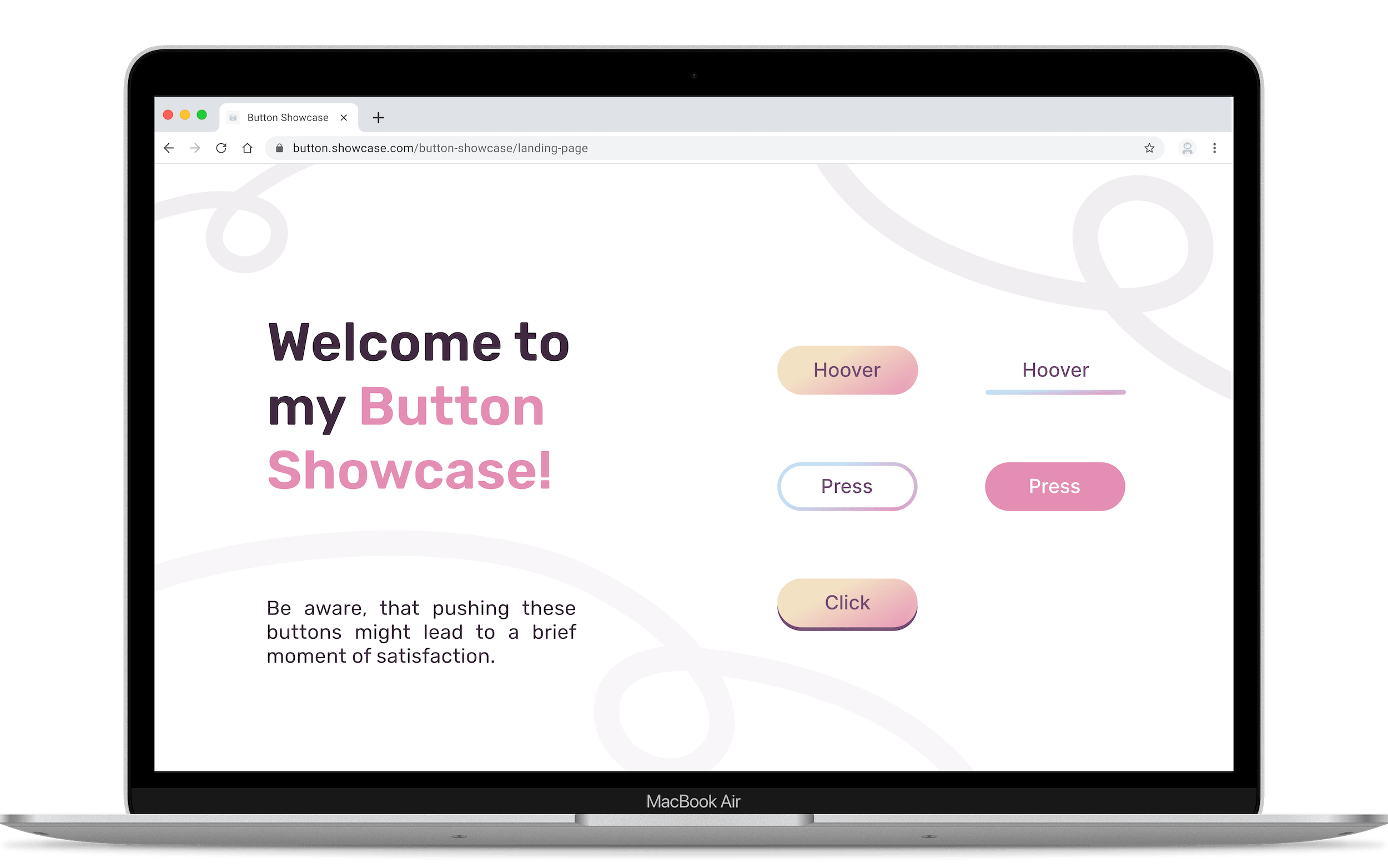
Daily UI Challenge 83 was focused on a fundamental yet critical element of any interface: the button.
In my 30-minute attempt at this task, I designed the three most common button states and incorporated subtle motion design to emphasize the actions that can be performed using them. This simple focus allowed me to ensure the buttons were not only visually appealing but also provided clear, intuitive feedback to the user upon interaction.
Feel welcome to click through the prototype below and interact with the buttons!
Button Showcase
#088 Challenge
For Challenge #088, the goal was to design a sign-up page, modal, form, or app screen. I decided to take it a step further by not only creating a simple Login/Register page but also making it responsive across various devices using Figma Variables and Modes. Here are the results, which I completed within a 2.5-hour timeframe. It was a lot of fun!
Variables and Modes Quick Overview
Final Design for Different Responsiveness
After setting up all the variables and modes, and then adjusting the frames' minimum and maximum sizes along with the responsive auto layout settings, you can switch between screens for different devices with just a single click in Figma's Modes toggle
#093 Challenge
The #093 challenge aimed at designing a conceptual Splash Screen for a mobile app. The goal was to create a design that effectively introduces the app's brand and core utility during the brief loading period, focusing on principles of speed, clarity, and visual engagement.
Design Concept
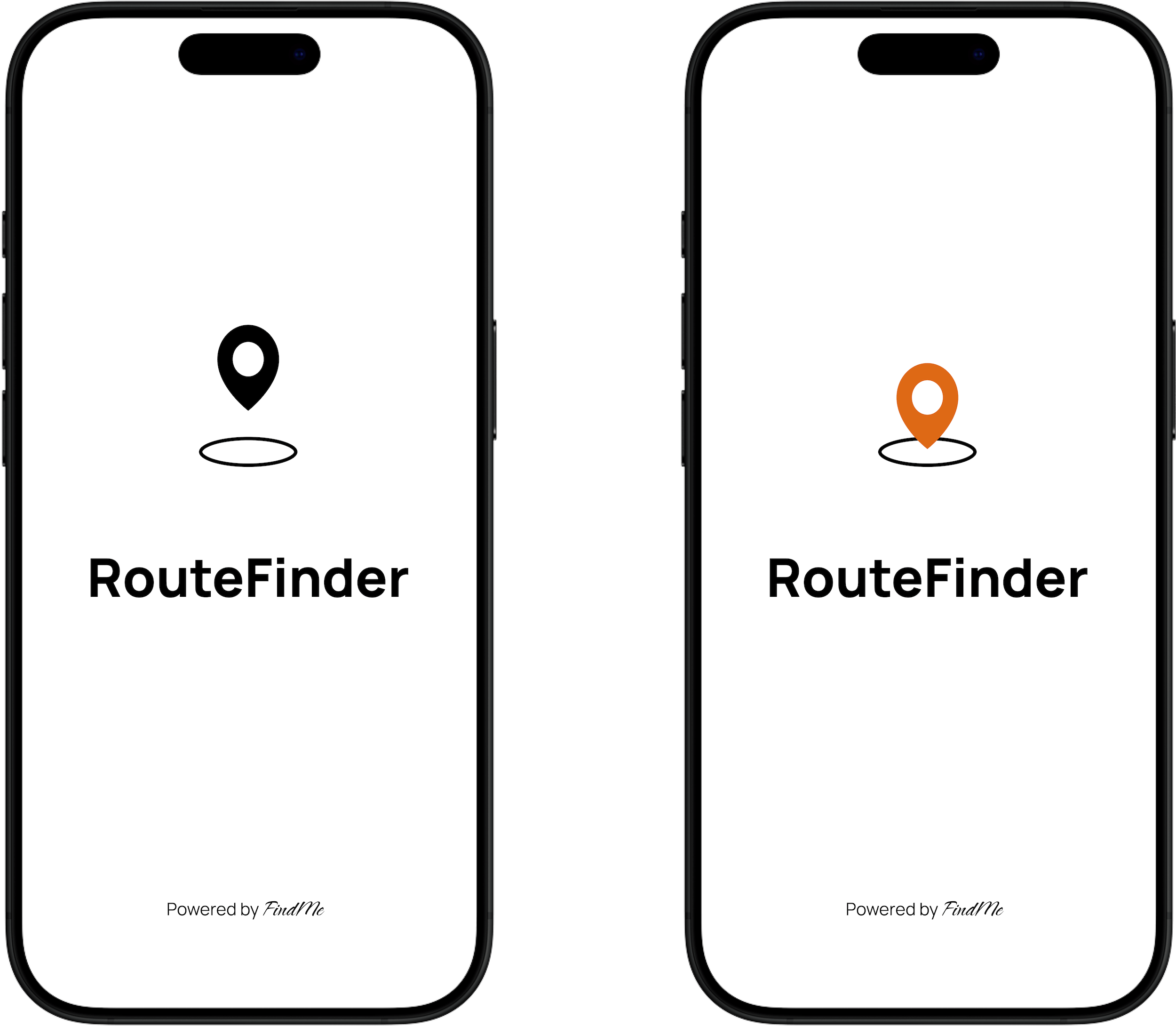
For this challenge, I designed the splash screen for RouteFinder, a public transit and destination tracking app. My approach was to create a design that instantly communicates the app's promise: uncomplicated and clear transport solutions.
Aesthetic: I chose a robust and simple aesthetic using a clean, bright white background to emphasize speed and avoid visual clutter.
Focus: The central element is a high-contrast localization icon, symbolizing connectivity and destination tracking.
Functionality: I included a simple animation showing movement from the icon, which reinforces the concept of instant route calculation and destination guidance. The animation concept is available for review under the prototype link.
The Final Outcome
This minimalist, highly functional design prioritizes the user's immediate need for information and utility. The entire process—from initial ideation to creating the visual concept and setting up the prototyping links in Figma—took approximately 30 to 40 minutes to complete.


